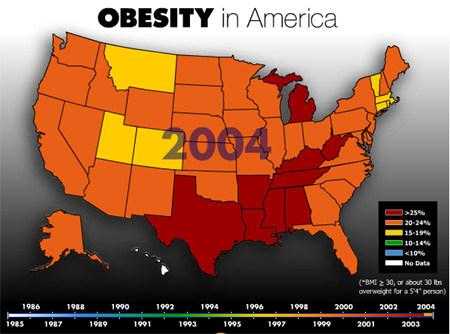
Map of American Obesity from MSN
MSN has an online slideshow of a map of the United States showing the obesity rates from 1985 to 2004. You can see it by clicking on the map below:
The problem that I have is that this information is presented as fact when the map was created using questionable data:
In 1998, the CDC changed the BMI numbers corresponding to obesity. With a change in accounting, suddenly the United States became “fatter.”
The CDC is based on self-reported height and weight collected through telephone surveys rather than actually weighing people. Not only is this data based on heresay, it is only a measurement of people willing to answer telephone surveys.
In actuality, this map tells me nothing. Is Utah less fat than Texas? I don’t know and I can’t depend on MSN to give me a legitimate answer if they consider the phone surveys from CDC to be “good enough.”
It appears that the major media is really spreading the idea of the Obesity Epidemic. I’m not buying it. I want to eat healthy and exercise so I can live a long time and look good, but I don’t think anyone has been “scared straight” when it comes to eating healthy.
Via: Boing Boing: Animated map of American obesity 1985-2004
Previous: Exerting Control
Next: Scott Adams Defends Fat Acceptance
 Buy Walking Videos
July 13th, 2006 at 7:22 am
I thought the animation specified that they defined obese (for all years) as some specific BMI. Not that they used the historical definition of obese for the animation.
July 13th, 2006 at 12:23 pm
According to the so called charts I am “obese”. I am 5’8″ and the last time I weighted I was 198 (I was 196 a couple days before and it has been holding steady their for some time despite my exercise routine and diet). However if you look at this photo
http://www.flickr.com/photos/linkerjpatrick/172201031/
I think you can agree I don’t look “obese”. I little bit overweight maybe. I’m a little full in my face, have a little fat in my sides and a little bit of a stomach but I certainly don’t have a huge “beer-belly” gut or anything like that.
The charts say I should be “164” to be considered “normal” but I personally would be happy to be 175. I rather have a little bit extra instead of being a “stick”. In fact my insurance is not as strict to say I need to be 164. If I get down to 180 or so I get somewhat of a discount on my health insurance and i’m working on it.
July 13th, 2006 at 12:23 pm
People lie on the phone about weight and other studdies prove this.
Val
July 14th, 2006 at 9:05 am
As R.M. says, the map uses BMI 30 as a breakpoint — but 1989 is at the very beginning of the scale, so it wouldn’t even matter, anyway.
People do misstate their weight and height. Researchers know pretty precisely by how much (they understate their weight, and overstate their height). Researchers do large scale telephone surveys, smaller door-to-door surveys with later measurement, and smaller yet carry-the-scale-to-the-house surveys. The point is that the tendency to misstate and the degree of misstatement is a constant that hasn’t varied over the years, and since the map measures a trend, it doesn’t matter.